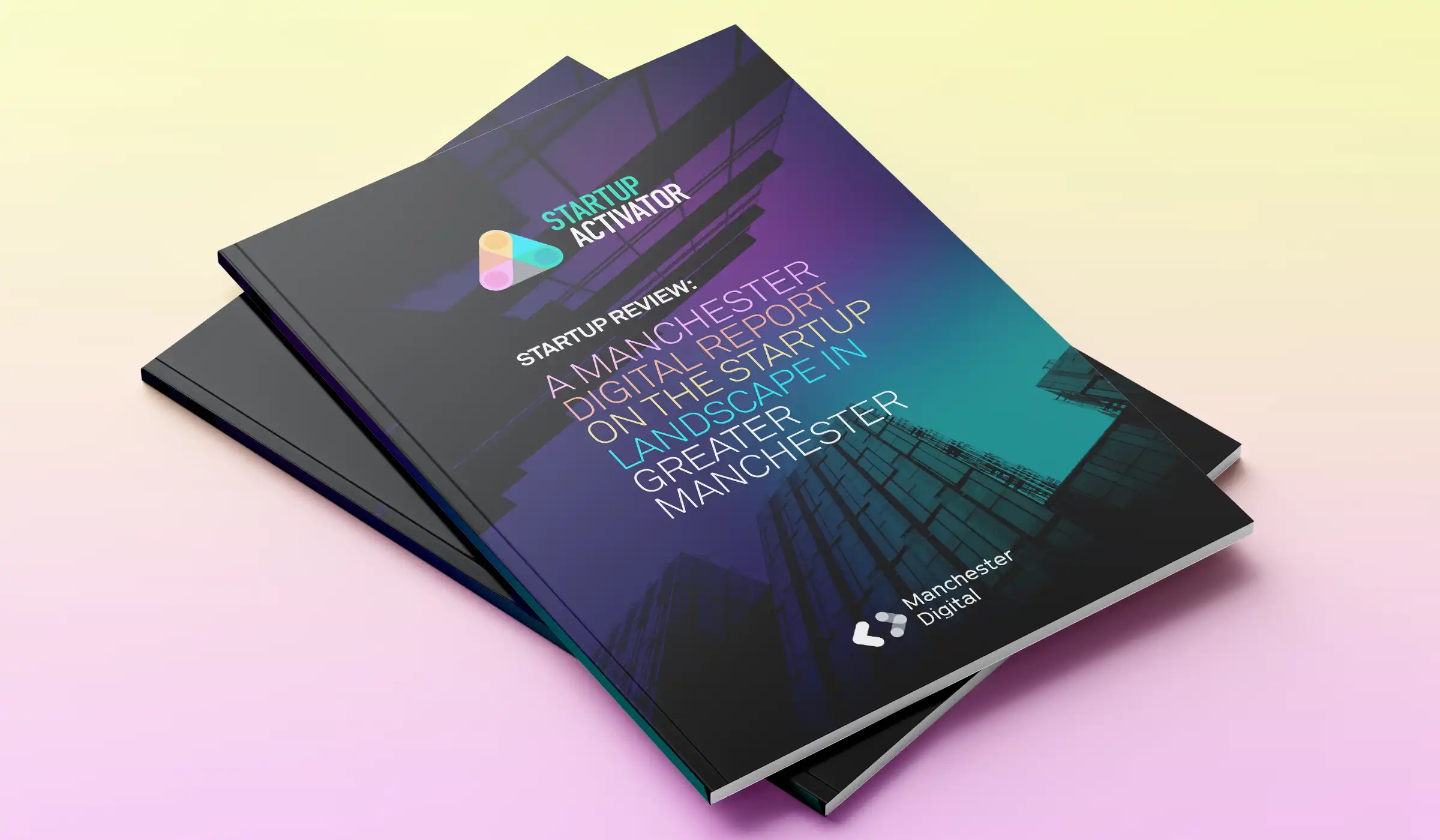
The Startup Activator offers expert guidance, networks, and resources, providing access to world-class partners and investors. It’s dedicated to nurturing Manchester’s next generation of world-leading startups.
Manchester Digital already has a strong brand presence with associated groups like Apprenticeships, Digital Her, and the Skills Festival, each with its own logo, font, and color palette. We decided that the Startup Activator brand identity would complement this suite while standing out in its own right. The visual identity gives the brand the independence to be recognized as a standalone entity.
The brand identity mark draws inspiration from the original Manchester Digital logo but has been reimagined to represent a diverse network working together. The design features intersecting elements that symbolize collaboration and connectivity.
While the font structure remains consistent, the color palette has been expanded to include a more varied and optimistic range of hues. This dynamic, modern palette highlights the cutting-edge business and tech industries it represents and reproduces well across both screen and print.
The graphic design builds on the existing Manchester Digital brand styling but evolves to reflect the dynamic nature of modern tech businesses. The color palette is used strategically to highlight data and statistics, making the presentation of information more engaging.


The Startup Review is published every six months, offering a mix of commentary, news, and statistics on Manchester’s vibrant digital businesses and investments. The brochure is designed with a modern, informative style and a flexible grid structure that adapts to various content types, ensuring layouts remain interesting across pages.
Information and data within the brochure are presented in visually compelling ways to capture the reader’s attention and emphasize key points.