Brand identity for independent sustainable re-works fashion brand and pre-loved clothing boutique.
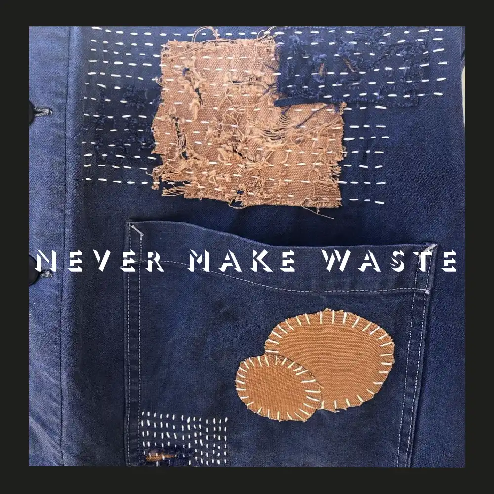
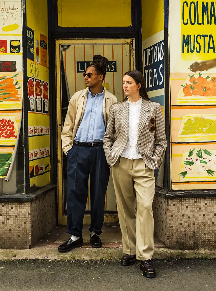
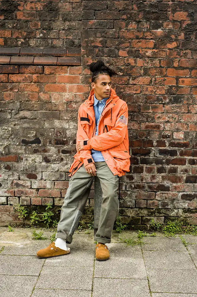
Never Make Waste specialise in individually selected, pre-loved fashion garments. Some of which are then re-worked, transformed or re-imagined by design talent around the North West; or considerately repaired, re-newed and brought back giving a fresh lease of life.
A brand identity set developed for fashion and clothing boutique Never Make Waste. This graphic identity consists of a typographic logo, paired with an abstract deconstructed brand mark and brand statement.
Never Make Waste feel the need to be working towards a more circular approach and are committed to try and bring quality clothes, sourced and made in the right way. ‘Vintage’ has become a buzzword in recent times and although people are now more open to the idea of sustainability in fashion, they are slightly unaware of the manner in which some of these vintage clothes are now sourced, shipped or dumped around the globe.
‘Re-think. Re-new. Re-work. Re-love’.
We worked with the team at NMW help develop a starting point vision for their brand strategy. They were completely open for these ideas to be explored and developed to create a more striking, dynamic visual brand structure, which could work both as a set or broken down and applied individually.
The font used for the logotype is a stencil shadow style rework of Gil Sans, the classic 1930’s sans serif. When analysed, this typography gives the effect of elements coming together to make up the statement.
The brand mark itself is a loose abstraction of the letters ‘N’, ‘M’ and ‘W’, using stems and strokes of the font titling. When used in such loose way the font breaks down and deconstructs on the eye when viewed.
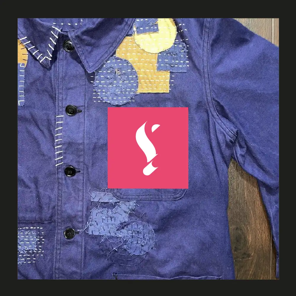
This graphic brand identity icon is used in isolation to be applied as an identifier or logo for fashion apparel. This structure when overlaid, either over window or image, creates an intriguing mask texture.
Part of this fashion brand identity set is the use of the ‘Snark’ or percontation mark. A backwards facing question mark used to denote the presence of irony. This a reference question to perceptions of vintage and a pre-loved society and what this means.
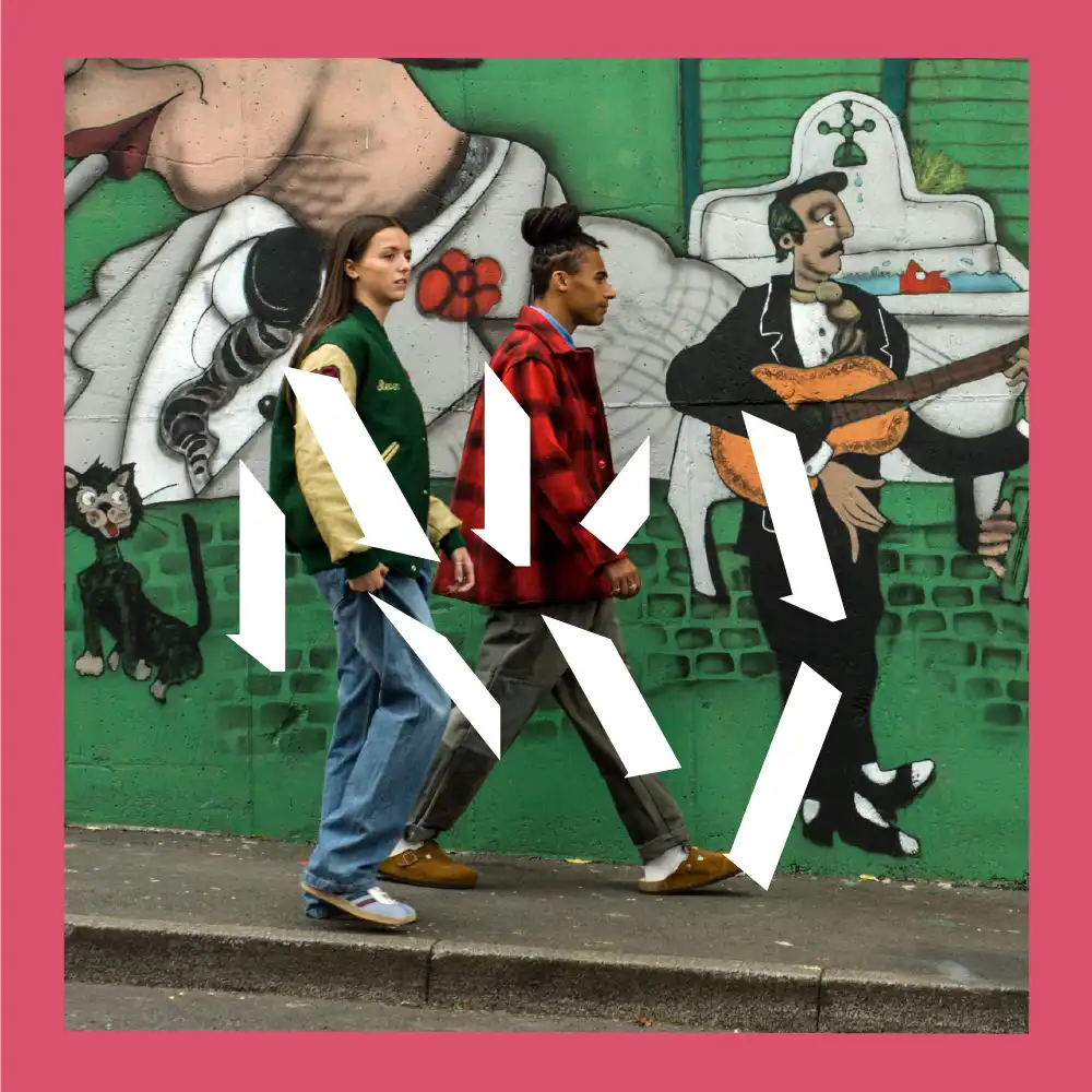
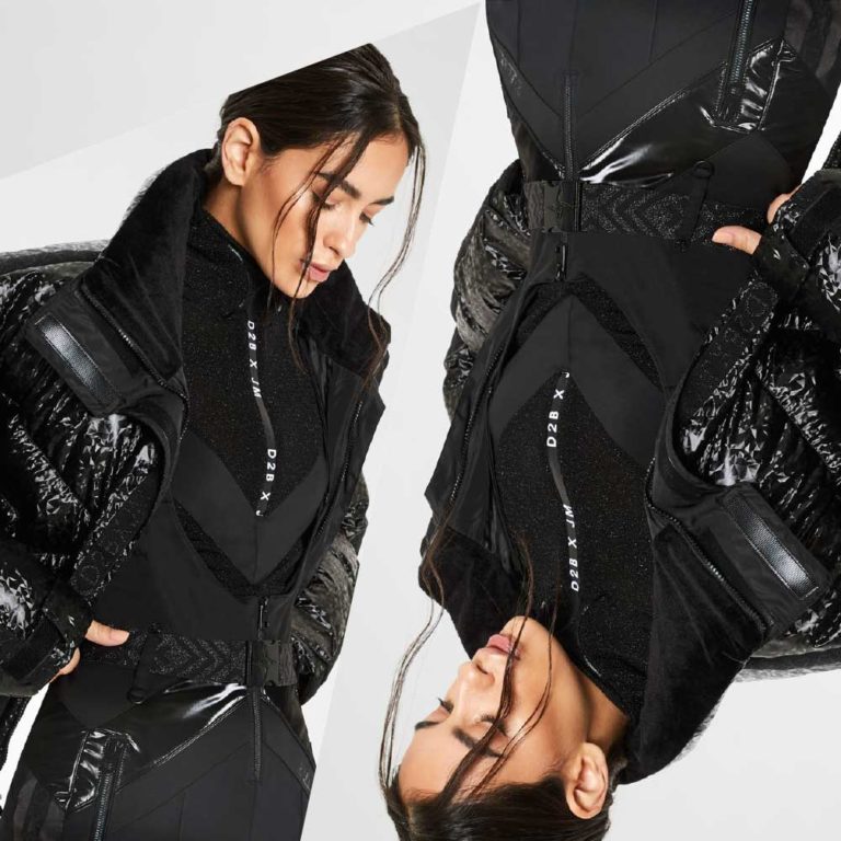
To launch, an atmospheric photoshoot was taken in and around the back streets of Stockport, not so much to advertise the garments but as a style setter for what this brand represents and the attitude it permeates.
The involvement at the start of the process was key to the success of the shop. Ideas were placed into the context of the physical and digital environments where we would be operating. The branding came to life very quickly and helped us to develop a strong retail environment from the start. We are working with GOTO on further develop the brand into other channels. GOTO definitely went the extra mile to understand our needs, proposition and customers.
John Whitehead. – Founder, Never Make Waste
The purpose – where I start – is the idea of use. It is not recycling, it’s reuse.