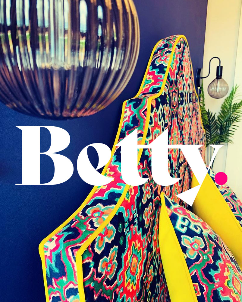
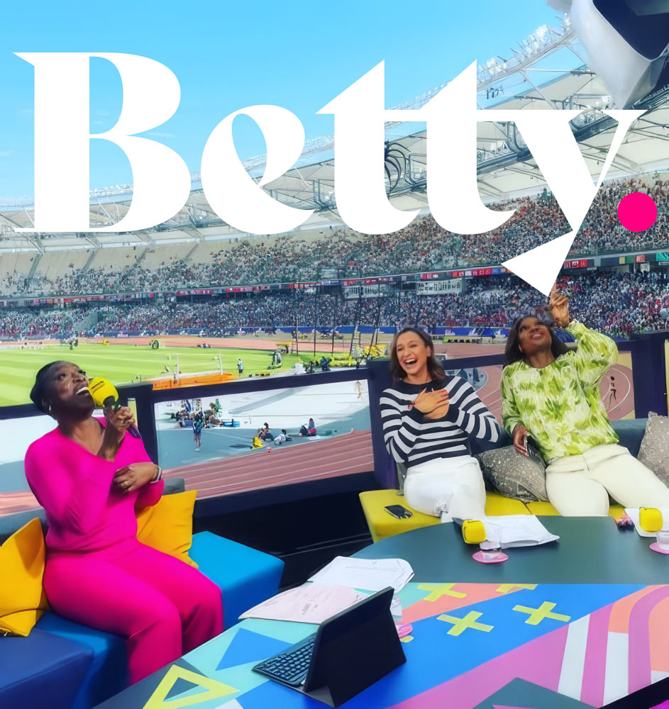
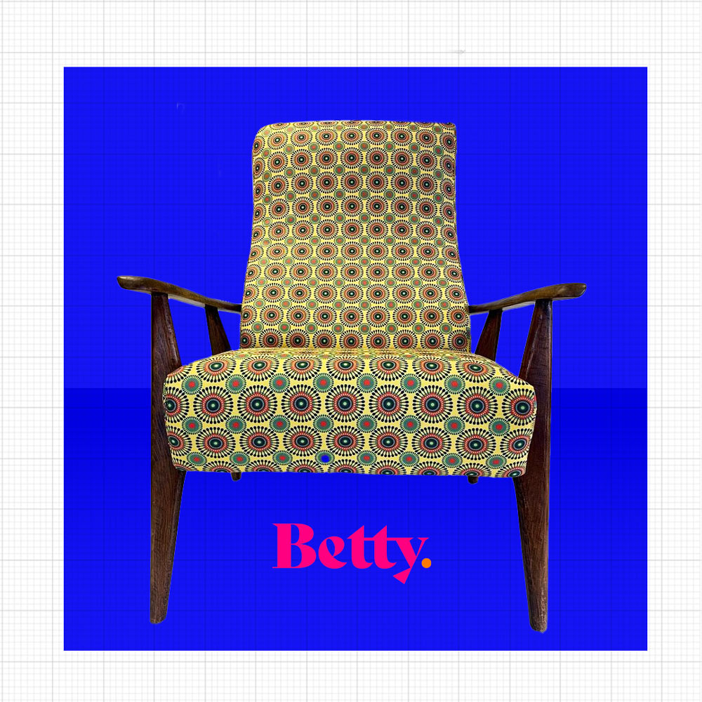
As with most business start-ups; the needs and direction of the business had changed over the last few years. Personal commissions were still a big part of Upholstery by Betty’s plan, but due to their reputation and skillset they were now being courted by larger business and brands for more corporate projects. They even have commissions from the BBC for studio upholstery, as seen on the European Athletic Championships live studio coverage
In the first instance the logotype was to be the full title of the business – ‘Upholstery by Betty’ or an alternative suggestion was ‘UBB’. After an extensive in-depth brand exploration and time spent together we felt it made more sense to rebrand simply as ‘Betty’.

A large part of this company is the energy, passion, style and personality of the founder; Beth Pemberton and so it made more sense to put the emphasis and reflection here. The typographic styling and flair in this logotype allows the personality and character to shine through. Bold & characterful.
The simplicity of this naming also gives a more professional feel of a larger brand.
This brand name re-structuture also allows the team to have amore diverse offering in the items they produce as the company expands.


A bold, vivid colour palette was developed, with options to vary the logotype. This colour approach is dependant upon the application and mood of the piece it is applied to; or fabrics it was balanced against.

GOTO Creative Ltd.
Merchants House. Market Place. Stockport, SK1 1EU
0161 474 8109